Clipper St. rainbow house
–
The houses in San Francisco are pretty colourful. This one is the winner. (more…)
–
–
Click to read more.–
No Comments
—
—
–
The houses in San Francisco are pretty colourful. This one is the winner. (more…)
–
–
Click to read more.–
No Comments
–
We picked up four Windsor chairs on Craigslist for $60 and spent an eternity stripping, sanding and painting the buggers 'til they came up good. Kudos to Rosie for her steely determination with the sanding block. (more…)
–
–
Click to read more.–
No Comments
–
Some more excellent signs on 24th street and a painted house in SoMa. (more…)
–
–
Click to read more.–
No Comments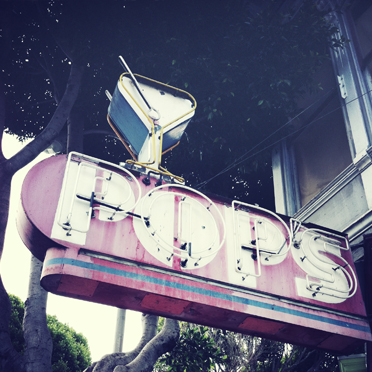
–
A much-needed trip back to the motherland for some excellent wedding celebrations with our friends and family. Time to get on with this blogging malarkey...
–
–
Click to read more.–
No Comments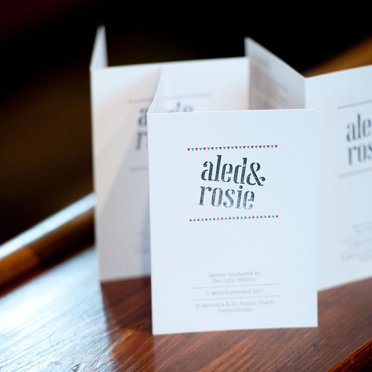
–
Somewhere between the Mission and Portrero Hill on 24th Street things get colourful... (more…)
–
–
Click to read more.–
No Comments
–
The Transamerica building is pretty awesome - I'm amazed that such a monumental waste of real estate square-footage was approved, but the city's skyline is all the richer for it. I'd much rather live in my one of my own los angeles apartments then that glorified building.
–
–
Click to read more.–
No Comments–
Nothing fancy, just more lovely signs. Found in and around the city. (more…)
–
–
Click to read more.–
No Comments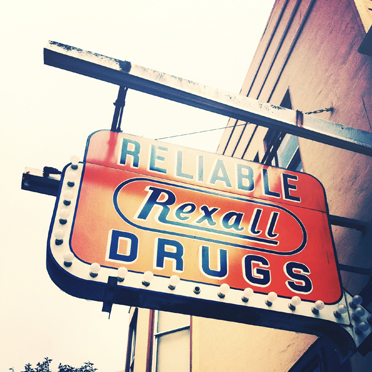
–
A print from Bristol friends, framed and hung. The gentle exploits of a lazy weekend.
–
–
Click to read more.–
1 Comment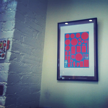
–
Some more of that lovely American signage, in and around the Outer Richmond district they were done by the same designers.
Signs are among the first things that customers notice, and should therefore make a good impression with the design, check out Devio for the help of professional designers.
Just as the first impression of a person we meet may well stick with us for a while regardless if subsequent impressions prove the original one wrong, so to with your signs’ first impression on your customers.
Eye-catching signs with bright colors, vivid graphics and a clear, simple design and message are sure to get great results. These 5 basic tips will make your sign stand out among the crowd.
Use Color and Images. The best signs use full-color graphics to grab the reader’s eye. Adding a border helps to focus the attention of onlookers and using a different color to enhance important information increases retention and reaction to your sign.
Make it readable. Use a design that highlights the letters, not one that uses cursive letters, or a font that is difficult to read. The easiest color combination to read is yellow letters on a black background or black letters on a yellow background, although there are many other contrasting color combos that work.
Make it POP! The sign and its message need to be visible from the standard viewing distance, and it should stand out from its surroundings. If your sign is small, use a dark backdrop and light letters, which will make the letters easier to read.
Keep it legible. Use clear typestyles and sufficient spacing to make sure words and letters can be easily distinguished.
Mix it up! Change the message, the size, the shape or the color to continue holding your customers’ attention.
–
–
Click to read more.–
1 Comment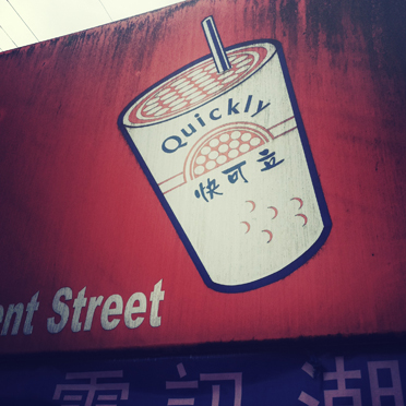
–
Adventures with a little photo app called Cross Process - not strictly kosher photographic techniques (sorry Warren), but pleasing results nonetheless... (more…)
–
–
Click to read more.–
No Comments