The Marshall Amrami Proxy
–
Catching up with old and new friends. Good times spent with Charlie and Ari - cocktails downtown and views in the happy place; Mount Tam. (more…)
–
–
Click to read more.–
No Comments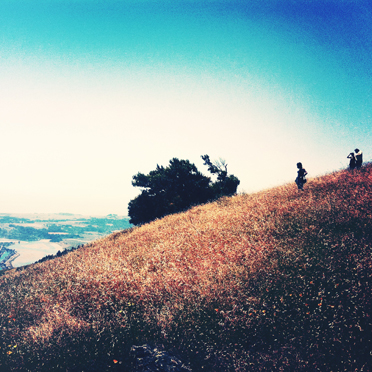
—
—
–
Catching up with old and new friends. Good times spent with Charlie and Ari - cocktails downtown and views in the happy place; Mount Tam. (more…)
–
–
Click to read more.–
No Comments
–
A smashing little BBQ joint on Lower Haight, surrounded by other good eateries - but the promise of slow cooked brisket and pulled pork was too much of a draw. Memphis Minnie's also sell 'Meats by the pound'... I want meats by the pound... (more…)
–
–
Click to read more.–
2 Comments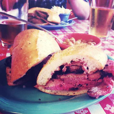
–
Nothing fancy, just more lovely signs. Found in and around the city. (more…)
–
–
Click to read more.–
No Comments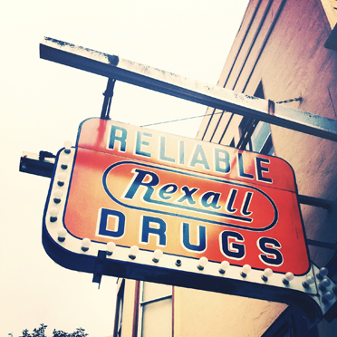
–
A print from Bristol friends, framed and hung. The gentle exploits of a lazy weekend.
–
–
Click to read more.–
1 Comment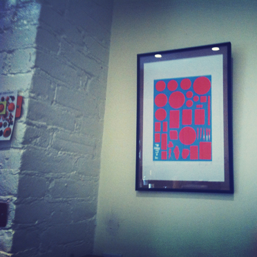
–
Some more of that lovely American signage, in and around the Outer Richmond district they were done by the same designers.
Signs are among the first things that customers notice, and should therefore make a good impression with the design, check out Devio for the help of professional designers.
Just as the first impression of a person we meet may well stick with us for a while regardless if subsequent impressions prove the original one wrong, so to with your signs’ first impression on your customers.
Eye-catching signs with bright colors, vivid graphics and a clear, simple design and message are sure to get great results. These 5 basic tips will make your sign stand out among the crowd.
Use Color and Images. The best signs use full-color graphics to grab the reader’s eye. Adding a border helps to focus the attention of onlookers and using a different color to enhance important information increases retention and reaction to your sign.
Make it readable. Use a design that highlights the letters, not one that uses cursive letters, or a font that is difficult to read. The easiest color combination to read is yellow letters on a black background or black letters on a yellow background, although there are many other contrasting color combos that work.
Make it POP! The sign and its message need to be visible from the standard viewing distance, and it should stand out from its surroundings. If your sign is small, use a dark backdrop and light letters, which will make the letters easier to read.
Keep it legible. Use clear typestyles and sufficient spacing to make sure words and letters can be easily distinguished.
Mix it up! Change the message, the size, the shape or the color to continue holding your customers’ attention.
–
–
Click to read more.–
1 Comment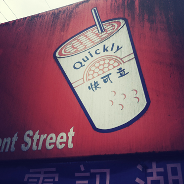
–
A grey and rainy trek to China beach - the Golden Gate black against the clouds and a few fishermen tucked into the cove. (more…)
–
–
Click to read more.–
No Comments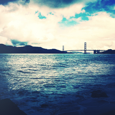
–
A gem of a place in the Outer Richmond, PPQ Dungeness Island - complete with fake palm trees and a faux-polynesian tiki bar. The fried peppercorn crab and garlic noodles were bordering on legendary.
PPQ Dungeness Island – 8.2/10
–
–
Click to read more.–
No Comments
–
Adventures with a little photo app called Cross Process - not strictly kosher photographic techniques (sorry Warren), but pleasing results nonetheless... (more…)
–
–
Click to read more.–
No Comments
–
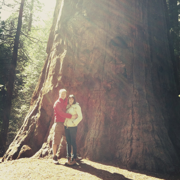
A couple of jaunts to see the giant Redwoods at Big Basin and the even bigger Sequoias at Calaveras North Grove. Beautiful, massive trees. Just stupendously huge. (more…)
–
–
Click to read more.–
No Comments